



Menu Makko:root { --blue: #212551; --yellow: #ECAE22; --white: #FFFFFF; --gray-bg: #F2F2F4; --gray-text: #666; }*, *::before, *::after { margin: 0; padding: 0; box-sizing: border-box; } body { font-family: 'Cabin', sans-serif; background: #FAFAFA; }/* ═══════════════════════════════════════ NAVBAR ═══════════════════════════════════════ */ .navbar { position: fixed; top: 0; left: 0; right: 0; z-index: 1000; padding: 30px 24px; }.navbar-inner { max-width: 1200px; margin: 0 auto; background: var(--white); border-radius: 60px; padding: 10px 12px 10px 20px; display: flex; align-items: center; justify-content: space-between; box-shadow: 0 2px 20px rgba(33, 37, 81, 0.06), 0 0 0 1px rgba(33, 37, 81, 0.03); transition: box-shadow 0.3s ease; }.navbar-inner.scrolled { box-shadow: 0 4px 32px rgba(33, 37, 81, 0.1), 0 0 0 1px rgba(33, 37, 81, 0.05); }/* ═══════════════════════════════════════ LOGO ═══════════════════════════════════════ */ .nav-logo { flex-shrink: 0; display: flex; align-items: center; } .nav-logo img { height: 32px; width: auto; }/* ═══════════════════════════════════════ DESKTOP NAV LINKS ═══════════════════════════════════════ */ .nav-links { display: flex; align-items: center; gap: 2px; list-style: none; }.nav-links > li > a { font-family: 'Montserrat', sans-serif; font-weight: 600; font-size: 13.5px; color: var(--blue); text-decoration: none; padding: 10px 16px; border-radius: 40px; transition: background 0.2s, color 0.2s; white-space: nowrap; display: flex; align-items: center; gap: 6px; }.nav-links > li > a:hover { background: var(--gray-bg); }/* ═══════════════════════════════════════ DROPDOWN ═══════════════════════════════════════ */ .nav-dropdown { position: relative; }.nav-dropdown > a::after { content: ''; width: 0; height: 0; border-left: 4px solid transparent; border-right: 4px solid transparent; border-top: 5px solid var(--blue); opacity: 0.35; transition: transform 0.25s ease; }.nav-dropdown:hover > a::after { transform: rotate(180deg); }.dropdown-menu { position: absolute; top: calc(100% + 8px); left: 50%; transform: translateX(-50%) translateY(8px); background: var(--white); border-radius: 16px; padding: 8px; min-width: 260px; box-shadow: 0 8px 40px rgba(33, 37, 81, 0.12), 0 0 0 1px rgba(33, 37, 81, 0.04); opacity: 0; visibility: hidden; transition: all 0.2s ease; list-style: none; }.nav-dropdown:hover .dropdown-menu { opacity: 1; visibility: visible; transform: translateX(-50%) translateY(0); }.dropdown-menu li a { display: flex; align-items: center; gap: 12px; padding: 10px 14px; font-family: 'Montserrat', sans-serif; font-weight: 600; font-size: 13px; border-radius: 10px; color: var(--blue); text-decoration: none; transition: background 0.15s; }.dropdown-menu li a:hover { background: var(--gray-bg); }.dd-icon { width: 34px; height: 34px; border-radius: 8px; display: flex; align-items: center; justify-content: center; font-size: 15px; flex-shrink: 0; }.dd-icon.blue { background: rgba(33, 37, 81, 0.06); } .dd-icon.yellow { background: rgba(236, 174, 34, 0.12); } .dd-icon.green { background: rgba(29, 158, 117, 0.1); } .dd-icon.purple { background: rgba(127, 90, 220, 0.1); }.dd-text .dd-label { display: block; font-size: 13px; color: var(--blue); } .dd-text .dd-desc { display: block; font-size: 11px; color: #999; font-weight: 400; margin-top: 1px; font-family: 'Cabin', sans-serif; }/* ═══════════════════════════════════════ RIGHT SIDE ═══════════════════════════════════════ */ .nav-right { display: flex; align-items: center; gap: 6px; flex-shrink: 0; }.nav-app { font-family: 'Montserrat', sans-serif; font-weight: 600; font-size: 13.5px; color: var(--blue); text-decoration: none; padding: 10px 16px; border-radius: 40px; transition: background 0.2s; white-space: nowrap; }.nav-app:hover { background: var(--gray-bg); }.nav-cta { font-family: 'Montserrat', sans-serif; font-weight: 700; font-size: 13px; color: var(--blue); background: var(--yellow); padding: 12px 24px; border-radius: 40px; text-decoration: none; border: none; cursor: pointer; transition: all 0.2s; white-space: nowrap; }/* ═══════════════════════════════════════ BURGER (mobile) ═══════════════════════════════════════ */ .nav-burger { display: none; width: 44px; height: 44px; border-radius: 50%; background: var(--gray-bg); border: none; cursor: pointer; position: relative; flex-shrink: 0; transition: background 0.2s; }.nav-burger:hover { background: #E8E8EA; }.nav-burger span { display: block; width: 18px; height: 2px; background: var(--blue); border-radius: 2px; position: absolute; left: 50%; transform: translateX(-50%); transition: all 0.3s cubic-bezier(0.4, 0, 0.2, 1); }.nav-burger span:nth-child(1) { top: 15px; } .nav-burger span:nth-child(2) { top: 21px; } .nav-burger span:nth-child(3) { top: 27px; }.nav-burger.open span:nth-child(1) { top: 21px; transform: translateX(-50%) rotate(45deg); } .nav-burger.open span:nth-child(2) { opacity: 0; transform: translateX(-50%) scaleX(0); } .nav-burger.open span:nth-child(3) { top: 21px; transform: translateX(-50%) rotate(-45deg); }/* ═══════════════════════════════════════ MOBILE MENU ═══════════════════════════════════════ */ .mobile-menu { display: none; position: fixed; top: 0; left: 0; right: 0; bottom: 0; z-index: 999; background: rgba(33, 37, 81, 0.2); backdrop-filter: blur(4px); opacity: 0; visibility: hidden; transition: all 0.3s ease; }.mobile-menu.open { opacity: 1; visibility: visible; }.mobile-menu-inner { position: absolute; top: 80px; left: 16px; right: 16px; background: var(--white); border-radius: 24px; padding: 8px; box-shadow: 0 16px 64px rgba(33, 37, 81, 0.15); transform: translateY(-16px); transition: transform 0.3s cubic-bezier(0.4, 0, 0.2, 1); max-height: calc(100vh - 120px); overflow-y: auto; }.mobile-menu.open .mobile-menu-inner { transform: translateY(0); }.mobile-section-label { font-family: 'Montserrat', sans-serif; font-weight: 700; font-size: 10px; color: #BBB; text-transform: uppercase; letter-spacing: 1.5px; padding: 12px 20px 4px; }.mobile-menu-links { list-style: none; padding: 0; }.mobile-menu-links a { display: flex; align-items: center; gap: 12px; font-family: 'Montserrat', sans-serif; font-weight: 600; font-size: 15px; color: var(--blue); text-decoration: none; padding: 12px 20px; border-radius: 14px; transition: background 0.15s; }.mobile-menu-links a:hover, .mobile-menu-links a:active { background: var(--gray-bg); }.mobile-menu-links .m-icon { width: 36px; height: 36px; border-radius: 10px; display: flex; align-items: center; justify-content: center; font-size: 16px; flex-shrink: 0; }.mobile-menu-links .m-icon.blue { background: rgba(33, 37, 81, 0.06); } .mobile-menu-links .m-icon.yellow { background: rgba(236, 174, 34, 0.12); } .mobile-menu-links .m-icon.green { background: rgba(29, 158, 117, 0.1); } .mobile-menu-links .m-icon.purple { background: rgba(127, 90, 220, 0.1); }.mobile-divider { height: 1px; background: #F0F0F0; margin: 6px 16px; }.mobile-cta-area { padding: 8px; }.mobile-cta { display: block; font-family: 'Montserrat', sans-serif; font-weight: 700; font-size: 15px; color: var(--blue); background: var(--yellow); padding: 16px; border-radius: 16px; text-decoration: none; text-align: center; transition: all 0.2s; }.mobile-cta:hover { box-shadow: 0 4px 16px rgba(236, 174, 34, 0.35); }/* ═══════════════════════════════════════ RESPONSIVE ═══════════════════════════════════════ */ @media (max-width: 900px) { .navbar { padding: 12px 16px; } .navbar-inner { padding: 8px 8px 8px 16px; border-radius: 50px; } .nav-links { display: none; } .nav-cta-desktop { display: none; } .nav-burger { display: block; } .mobile-menu { display: block; } .nav-right { gap: 6px; } .nav-app { font-size: 13px; padding: 8px 14px; } .nav-logo img { height: 28px; } }const burger = document.getElementById('burgerBtn'); const mobileMenu = document.getElementById('mobileMenu');burger.addEventListener('click', () => { burger.classList.toggle('open'); mobileMenu.classList.toggle('open'); document.body.style.overflow = mobileMenu.classList.contains('open') ? 'hidden' : ''; });mobileMenu.addEventListener('click', (e) => { if (e.target === mobileMenu) { burger.classList.remove('open'); mobileMenu.classList.remove('open'); document.body.style.overflow = ''; } });const navInner = document.getElementById('navbarInner'); window.addEventListener('scroll', () => { navInner.classList.toggle('scrolled', window.scrollY > 20); });

MAKKO dans le magazine SERVICES

Makko est Γ  l’honneur dans le magazine SERVCIES. Revenons ensemble sur cette collaboration et sur notre vision de la propretΓ© Γ  l’usage.

9,5/10 de satisfaction client

+600 clients nous font confiance

Intervention dans toute la France

Faites vous accompagner par Makko pour l'entretient de vos espaces !

Makko Γ  l'honneur dans le magazine services

Table des matières

Faites votre devis personnalisΓ© gratuitement et soyez accompagnΓ© par Makko !

MakkoΒ figure dans le dernier numΓ©ro du magazineΒ SERVICESΒ ! Dans cette Γ©dition, le magazine met en avant une tendance qui bouscule les pratiques traditionnelles :Β la propretΓ© Γ  l’usage. Ce modΓ¨le innovant, basΓ© sur des interventions adaptΓ©es aux besoins rΓ©els des espaces de travail, est au cΕ“ur de notre approche chez Makko.

Un article qui explore les enjeux d’aujourd’hui

Au fil de cet article, vous pourrez dΓ©couvrir :
  • Les enjeux et opportunitΓ©sΒ liΓ©s Γ  cette tendance prometteuse, qui redΓ©finit le rapport aux services de propretΓ©.
  • Notre vision et nos solutions concrΓ¨tes, pensΓ©es pour rΓ©pondre efficacement et durablement aux attentes des entreprises modernes.
  • L’interview de notre prΓ©sident, ClΓ©ment Llehi, qui partage notre engagement et nos ambitions pour accompagner cette transition.
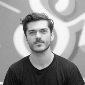

Β« L’objectif n’est pas simplement de rΓ©duire les coΓ»ts, mais d’apporter une vΓ©ritable valeur ajoutΓ©e aux utilisateurs finaux Β», – ClΓ©ment Llehi

DΓ©couvrez l’article complet

Curieux d’en savoir plus ? Retrouvez l’article complet dans le dernier numΓ©ro du magazineΒ SERVICESΒ !

:Γ©toile2:Β N’hΓ©sitez pas Γ  partager vos impressions ou Γ  Γ©changer avec nous sur ce sujet : c’est ensemble que nous construisons des solutions pour demain.